When your files are ready to send to us, please use the “Contact Me” form which can be found here. Type your information into the form, making sure to reference your catalog or job number, select the zipped file from your computer, and click “Submit”. Fast and simple!
Design FAQ
When you are ready to send in your project, please make sure you have included all of the following:
- If you are using Illustrator or InDesign, simply package the file. This will include all fonts and image links for you to send to us. If there is anything wrong with your document, the application will let you know. Instructions on how to package all files together for Illustrator can be found here, and for InDesign, here.
If you are unable to have your document automatically collect all of the included files for you, be sure to manually provide us with the following:
- Native design file (Adobe Photoshop / Illustrator / InDesign)
- All fonts if you haven’t converted them to paths (both the printer and screen font files – important!)
- All linked or embedded images (saved as CMYK, not RGB). All files must be created at 300 DPI for CMYK and Grayscale images and 1200 dots per inch for Bitmap TIFFs.
Here are a few more quick tips:
- For the sharpest text, it is best to create your type as vector elements (not pixel data, or rasterized text) unless you need to have an elaborate effect applied in Photoshop).
- Note that our standard rich black is 40% C, 30%M, 25%Y, and 100%K. Anything higher than that and the white text will not appear crisp.
- Do not use LZW compression when saving your TIFF files. If you are ever in doubt, feel free to contact our design department with any and all of your graphic and pre-press questions.
Our templates have pre-existing registration and crop marks included in the file to save you from complex and tedious set-up time and to ensure that your layout conforms to our specifications. All you have to do is drop all of the components of your layout (images, text) into the templates and save the file! As long as you follow these four simple rules, you should be fine:
- Make sure the artwork extends to the bleed line
- Outline your text or supply us with the font files
- Make sure all images are of a high resolution (300 dots per inch for CMYK and Grayscale images and 1200 dots per inch for Bitmap TIFFs).
- Do not flatten the layers (keep the template on a separate layer from your artwork)
We’ve created specific templates for each of the products we offer so be sure you are using the correct template for your individual project before you begin. Template downloads are available here.
Please note that if you do not use our templates when submitting your artwork, there is a (minimum) $50 “out of template” fee to cover the additional time and cost required for us to transfer your artwork into the proper template.
There are a few key guidelines that you must follow to ensure the highest quality of your scans:
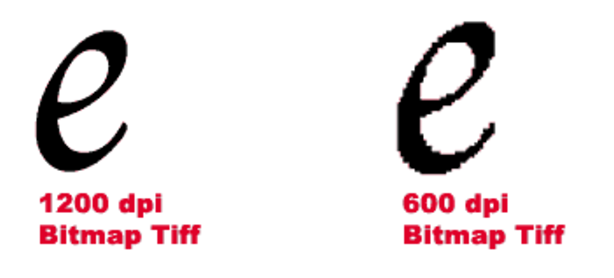
- All scans must be made at 300 pixels/dots per inch for CMYK and Grayscale images and 1200 dots per inch for line artwork at the actual size it will be printed. If you are scanning Bitmap line art, it is important that you scan your image in at a resolution of 1200 pixels/inch and save it as a Bitmap file, because this will give you a smoother image to work with. Also, use .TIFF files whenever possible. Bitmap TIFFs are quite different from CMYK or Grayscale TIFFs, which typically have an optimal print resolution of 300 dpi. These kinds of TIFFs contain color and value for each pixel that makes up the image. Bitmap TIFFs on the other hand, are made up of pixels that are either black or white (with no shades of gray). Therefore, these TIFFs require more pixels per inch in order to appear sharp to the naked eye. Bitmap TIFFs are perfect for solid black and white “line art” such as text or simple designs. They will appear sharper than the same images in Grayscale, as long as the dpi is set to 1200.
- Do not scan at a smaller size and then scale the photo to a larger size in the page layout software. If you intend on blowing up a 4” x 4” image to 12” x 12” for a record jacket cover, scan your image in at 300% to ensure that the image does not print all blurry and pixelated.
- Do not scan at a low resolution and then increase resolution in Photoshop (see the line above)
- If you have an image editor, such as Adobe Photoshop, you must convert your scans to CMYK color mode and then do color corrections before using them in your layout. If you don’t, your color will shift considerably and you won’t be happy.
- Save your scans as a .TIFF. Do not use BMP, .JPG, or .GIF files as they can degrade the quality of the image and do not allow you to save in CMYK mode. If you use .EPS files, please make sure that you save the image with an 8-bit TIFF preview.
- When saving an image as a .TIFF, do NOT to use LZW compression.
Converting your fonts to a graphic element (called rasterizing text in Photoshop and outlining text in Illustrator and InDesign) will eliminate the need to send us your font files. This will ensure that there are no odd font issues caused during production. However, always keep your original file that still requires the font(s) so that you can make quick edits should there be a need to send us revised artwork. We cannot make any text changes for you if you deliver files with text as paths or curves.
Process colors are the colors used in the 4-color process printing (Cyan, Magenta, Yellow, and blacK: commonly referred to as CMYK). This is a standard printing method employed by printers worldwide to print pieces with color photographs or illustrations.
Spot color printing is a technique in which solid ink is applied to a printing surface (as opposed to the CMYK patterned dot method). This is used on projects where special inks (like metallic colors or solid blocks of a specific color) are part of the color scheme and in circumstances where pure and complete ink coverage is desired. Spot colors are picked from the Pantone Matching System (PMS) palette, so they are consistent throughout the printing industry. If while creating your design you use spot colors but want us to print using CMYK, there will be, most likely, a noticeable shift in color. Check this link for more information on Pantone Spot to Process. Yep, this stuff is complicated.
Pantone Matching System, or PMS, is a universal color numbering system used by printers around the globe to duplicate any color you desire. To see a color and its corresponding PMS number, you’ll need a physical PMS color wheel chart. Only this color swatch book or look-up table will give you an accurate PMS color; don’t rely on your computer monitor! Unless your computer screen has been recently professionally calibrated, the color you see on the screen will sometimes be much different than what is output to film and paper. Note that a letter will follow the PMS number (such as PMS 486 C). If you are printing on a coated stock, choose the color with the suffix “C” at the end. If you are using a dull or unfinished stock, choose the letter “U”.
To learn more about PMS colors and how they are used in the printing industry, check out this link.
When designing center labels for vinyl records, color selection is very important – and sometimes counterintuitive. Unlike other products, labels for vinyl records are heated in an oven prior to being put onto the record press to extract all of the moisture from the paper. This reduces the unsightly cracking and bubbling of the label where they are hit with extreme heat and pressure during the pressing process.
PMS spot colors have a tendency to discolor during this baking process. In our testing, we’ve discovered that CMYK inks stay more true-to-color than PMS inks This is especially true with spot colors with a transparent white content of 50% or higher. Even PMS colors with a lower “Trans. Wt.” will sometimes have shifts in appearance. So, be mindful that using the same PMS color on the jacket and the label may sometimes result in a difference in color, and cannot be matched.
CMYK is the preferred method for designing vinyl labels. If PMS colors are desired, choose colors with a low Trans. Wt. concentration, and be forewarned that some color shift will take place in the manufacturing process.
Note on Metallic spot colors and vinyl labels: the heat and pressure on the press will somewhat dull the metallic ink. It’ll still look metallic but are bit muted compared with printing on a record jacket or insert.
The printing process requires the use of either four process colors: CMYK (Cyan, Magenta, Yellow, and Black) or specific Pantone colors. When your files are ready to be sent to Furnace, be sure they are all set to CMYK or a solid Pantone color.
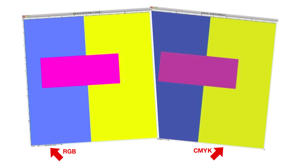
RGB color mode was designed to work with cameras, display monitors and televisions, not printed matter.
The RGB color scheme has a greater range of colors than CMYK and can produce colors that are more vivid and vibrant which is needed for screens. These colors are beyond the range of CMYK to reproduce and will come out darker and more dull in print than what is seen on the monitor or display.
Moral of the story, convert your RGB images to CMYK in your image editing software, color correct them to make them look exactly like you want and then submit them to us.
Colors may vary between monitors and printers. The color you see on your monitor or printer may not be exactly the same as the color that is printed on our press. If precise color-matching is critical to your project, then we highly recommend a press-printed proof. Otherwise, we cannot guarantee the final colors will be accurate. Please be aware that a request for a hard proof will incur additional fees as well as potential delays to your schedule. If you would like a hard proof, please contact your Furnace Sales Representative for more information.
In print there are many different ways to represent the color black. The simplest is considered “plain black”, or 100% black ink of CMYK (0C, 0M, 0Y, 100K). On the other hand, you may wish to create your artwork using a mixture of solid black over one or more of the other CMYK colors, resulting in a darker tone than black ink alone – this is referred to as “rich black”.
Rich black is often regarded as a color that is “blacker than black.” There are many different combinations of ink that can create colors such as “Cool Black” (60% Cyan, 0% Magenta, 0% Yellow, 100% Black) and “Warm Black” (0% Cyan, 60% Magenta, 30% Cyan, 100% Black) or our standard “Rich Black” combo (50% Cyan, 50% Magenta, 25% Yellow, and 100% Black.) The key is knowing when to use a rich black versus a plain black.
To see this difference in action, please check out this short video from Adobe on the difference between 100%K (plain black) and rich black.
On the other hand, if your project calls for a black and white only job, you would want to use plain black (100% K only). Another example of when you might consider using plain black over rich black is when you have segments of small text. Using a rich black for text could lead to legibility issues due to any misregistration that might occur during the printing process. This effect could result in your small text showing what is known as color halos.
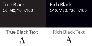
For most circumstances, we have found that the following color mix works well for a rich black: 40% C, 30% M, 25% Y, and 100% K. Feel free to let us know if you are unclear as to the best use of rich black vs. plain black in your specific design.
Your jacket design is done, it looks perfect but you have all these cool photos, lyrics and liner notes that you need to fit somewhere. What to do?
Sure, you could go with a standard printed insert. Totally respectable.
We think a printed inner-sleeve or inner-jacket is the way to go. Additional graphic space, the vinyl slips inside, two birds, one stone.
When you ditch the plain inner sleeve for a printed inner, you’ll have almost unlimited options when it comes to colors, finishes, textures, die-cuts, etc.
Furnace offers these in two flavors: printed inner-sleeves and printed inner-jackets.
Inner-sleeves are printed on either 100lb coated or 60lb uncoated offset paper. They get the job done for standard weight records.
Inner-jackets (sometimes referred to as disco-sleeves or disco-jackets) are printed on heavier, 12pt board stock. Nice and thick and recommended for heavyweight 180g records that tend to split the seams of standard paper inners.
Inner-Jackets are also used all by themselves as DJ single jackets. When spinning records, DJs don’t have time to take the record out of the jacket, then out of a sleeve. They need a simple package that holds up to travel and lots of use and abuse. DJ+Disco = Disco-Jacket.
Furnace accepts files compliant with most major page layout, illustration, and image editing applications. Submit your work using any of these applications below:
- .INDD (Adobe InDesign)
- .AI (Adobe Illustrator)
- .PSD (Adobe Photoshop)
- Print-ready PDF files (with image links embedded / saved at 300 dpi and text outlined)
Recommended image formats (saved as CMYK color):
- .TIF (do not use LWZ compression when saving!)
- .PSD (Adobe Photoshop)
Vector art formats:
- .AI (Adobe Illustrator)
- .EPS (Adobe Illustrator)
If we are creating artwork for you, submit your text using:
- .DOC (Microsoft Word)
- .TXT (ASCII Text)
Do not format your text into columns or attempt to lay it out. Simply submit your text using obvious text sizes to distinguish headers from body copy. If you are using files within applications other than those specified above, please contact our design department to discuss these matters in detail as we may not accept those files and / or design fees may apply to cover any conversions.
We do not accept Microsoft Publisher, Powerpoint or graphics embedded in Microsoft Word. Those applications are for hanging up signs around the office (often times using Comic Sans font) or in your personal scrapbook. We’re in the big leagues now…
There are three printing processes that are used on almost all of the products we offer: offset, digital or silk-screen printing.
Offset Printing refers to the process of using plates which transfer an image onto a roller where ink is applied (known as a plate cylinder) and then offset onto another cylinder (known as a “rubber blanket”). The image is then rolled onto sheets of paper. This process produces a clearer, sharper final image and is where offset printing gets its name from.
Offset Printing Advantages:
- High volume price efficient (the more you print, the cheaper the price piece becomes)
- Wider range of printing paper types with custom finishes can be used
- Better control on color and more Pantone ink choices available, thus offering a better quality end product.
- You can print at a higher printing quality, with greater detail and sharper images
Digital Printing involves a process where the artwork is processed from a computer and then printed directly onto the paper stock of your product. Much like a laser printer, which uses toner, or some larger printers which use liquid ink, digital printing eliminates the steps of a traditional offset printer (where plates are involved) and instead transfers inks to the paper simultaneously. This process produces a full-color print after only one pass through the printer, which takes less time to print and is less expensive for low volume print orders.
Digital Printing Advantages:
- Fast turnarounds
- Less expensive low volume printing
- Variable data capability (names, addresses, codes or numbering can be printed easily)
- Less paper waste
Jackets, booklets, inserts, vinyl record labels, etc are all printed using the offset process. We can even print full-color images onto CDs and DVDs using offset. Sometime, short run inserts and fold-overs covers can be printed using a high quality digital press because they now offer the same great look and quality of offset at a lower price point.
Silk-screen Printing is the process of applying ink to a screen and forcing it through holes in a stencil to create an image onto the surface of the substrate. It is most appropriate for up to 3 color printing – especially if the colors are Pantone colors and for solid ink coverage. Silk-screen printing can include up to 5 single colors, for 4 color process (CMYK) and is recommended for any Sticker order or CD jobs when only solid colors and no photographic images are used.
Silk-screen Printing Advantages:
- Large areas of solid color
- Bolder designs
- Gloss ink
Silk-screen Printing Disadvantages:
- Photographs and bitmap images
- Rasterized text
- Small or fine text and images
To achieve optimal color matching during the printing process, coated paper stock is used to ensure that the ink dots stay on the surface of the paper. After the paper is printed, a coating is often applied to protect the print from dirt and fingerprints as well as to achieve a certain look, feel and texture.
Aqueous coating is a clear, fast-drying water-based coating that improves the durability of the final printed piece and leaves a nice semi-gloss sheen.
Matte coating creates a slightly dull satin finish. It adds a nice finish that is not quite glossy but not totally dull either. This is our owner Eric’s favorite coating because he’s a print snob and likes the way it feels and smells (weird). A common misunderstanding is that matte coating is perfectly dull (no gloss), confusing it with…
Unfinished / Uncoated stock is what you are looking for if you want no trace of gloss whatsoever. Your design is printed straight onto uncoated paper stock – no gloss, no finishing coat – just ink and paper. Unfinished stock creates very different results than coated stock due to how the ink is absorbed into the paper during the printing process. If you would like to work with unfinished stock, make sure you or your designer has experience designing for uncoated print as there will be “dot gain” that darkens up the design and makes proofing totally unpredictable. Most newbies are disappointed with the look of their graphics when printed on uncoated stock because they don’t properly compensate for this dot-gain-darkening phenomenon. We warn you now, you are responsible for knowing how to design for uncoated and we can’t credit you or redo your print if you are unhappy with the outcome so ask a lot of questions and plan for the worse. But if done right, it can look really cool and create a vibe that coated printing can’t offer. If you’re worried that you’re going to eff this up, we suggest printing on coated paper and add a matte coating over the top. You get color accuracy with a nice dull-ish satin finish that is a good compromise between the two processes.
UV (ultraviolet) Gloss coating looks like you dipped a piece of paper in water – super glossy with almost a wet look. If you want your print to scream “hey, over here” then you want UV gloss. Unlike traditional aqueous semi-gloss or aqueous matte coatings which rapidly dry, UV compounds are applied wet to the paper and then dried/cured using a UV light. Beware that UV gloss will attract fingerprints like white on rice so don’t blame us if people complain to you that someone stole their fingerprint off your record cover and used their iPhone to buy a yacht using ApplePay.
UV Matte coating is similar to UV gloss but has more of a satin sheen and is less prone to fingerprints.
When printing onto paperboard (think jackets, wallets, etc), the entire design is printed on one side of the board and then folded and glued to create a double walled package with a pocket. To offer these items at a reasonable price, we use a paperboard sheet that is coated on just one side (C1S) and is left uncoated on the other so the printed side is on the coated and the inside of the package is uncoated.
As described above, some people like printing on an uncoated sheet as it gives off a moody vibe so it may be what you are looking for if you want no trace of gloss whatsoever. Your design is printed straight onto uncoated paper stock – no gloss, no finishing coat – just ink and paper. Unfinished stock creates very different results than coated stock due to how the ink is absorbed into the paper during the printing process. If you would like to work with unfinished stock, make sure you or your designer has experience designing for uncoated print as there will be “dot gain” that darkens up the design and makes proofing totally unpredictable. Most newbies are disappointed with the look of their graphics when printed on uncoated stock because they don’t properly compensate for this dot-gain-darkening phenomenon. We warn you now, you are responsible for knowing how to design for printing on uncoated stock and we can’t credit you or redo your print if you are unhappy with the outcome so ask a lot of questions and plan for the worse. But, if done right, it can look really cool and create a vibe that coated printing can’t offer. If you’re worried that you’re going to eff this up, we suggest printing on coated paper + a matte coating over the top. You get color accuracy with a nice dull-ish satin finish that is a good compromise between the two processes.
Printed images are constructed out of thousands if not millions of small halftone dots – and the tonal range you see in an image is determined by the size and spacing of these dots. If you create a halftone dot at one size and then print it onto paper where it can expand, your image will appear to be darker.
Dot gain is mainly affected by the type of paper used. With very absorbent paper (like uncoated stock or “reverse board”) you end up with a good deal of dot gain (dots grow larger and thus appear darker). Whereas with less absorbent paper (like coated paper or board)) there is very minimal dot gain.
As described in the Reverse Board FAQ, most newbies are disappointed with the look of their graphics when printed on uncoated stock because they don’t properly compensate for this dot-gain-darkening phenomenon. We warn you now, you are responsible for knowing how to design for printing on uncoated stock and we can’t credit you or redo your print if you are unhappy with the outcome so ask a lot of questions and plan for the worse. But if done right, it can look really cool and create a vibe that coated printing can’t offer. If you’re worried that you’re going to eff this up, we suggest printing on coated paper + matte coating over the top. You get color accuracy with a nice dull-ish satin finish that is a good compromise between the two processes.
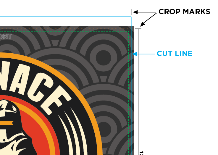
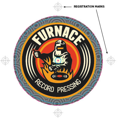
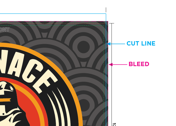
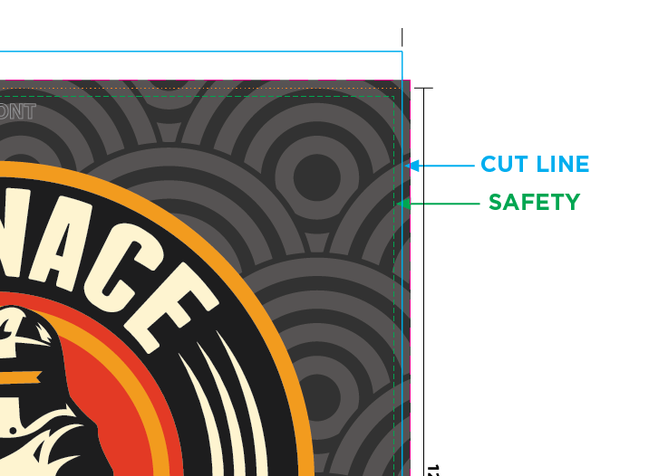
When the presses have stopped, your printed items are then cut down to size. Thus, it is important that the printer knows exactly where the boundaries are for each panel of your print. This is where crop marks come in. Crop marks are a tool that shows us exactly where to cut your print. Be sure to follow all of our specs and do not modify the crop marks. The crop marks are .75 mm thick and colored in 100% cyan, 100% magenta, 100% yellow, and 100% black (also known as Registration color).
When printing with multiple colors that overlap each other, the printer has to line these plates up perfectly so the printed image is tight and crisp and doesn’t look like a bad night out with beer goggles. When the colors all stack directly on top of each other, you achieve the perfect color balance. Registration marks are used to accomplish this task. They are simply targets located in the same place on each piece of film that are colored in 100% values of each of the four colors (or more if PMS spot colors are used). The templates provided by Furnace contain all required registration marks, so you need not worry about creating them yourself. In order to avoid project delays and cost overruns, only use Furnace supplied templates and do not edit these marks.
When cutting the paper stock containing your printed items, the blade may shift the paper stock ever so slightly. To prevent small white gaps at the edge of your print, it is required that all graphics around the edge of the page extend at least 1/8″ past the cut lines. Every Furnace template has guidelines to indicate how much bleed you need to add to your layouts in order to be safe. In order to avoid project delays and cost overruns, only use Furnace supplied templates.
The safety margin is a concept put into place to prevent trimming of essential elements in your layout (such as text). We require that your type and any other important non-bleed element be 1/8″ inside the crop marks. This way, if the cutter is slightly off, your type or images won’t end up on the cutting room floor or look oddly out of whack.
Perforation marks are dotted lines pressed into paper for either a fold or tear off to occur. These are the same dotted lines that you will find on old-school concert tickets for tearing off the stub. In our world, perforations are commonly found placed .25″ in from the a jewel case tray card’s left and right edges. This is where our packaging equipment will fold the sides of your tray card so the spines of the jewel case are visible. Your Furnace supplied tray card templates will contain all appropriate perforation marks. In order to avoid project delays and cost overruns, only use Furnace supplied templates.
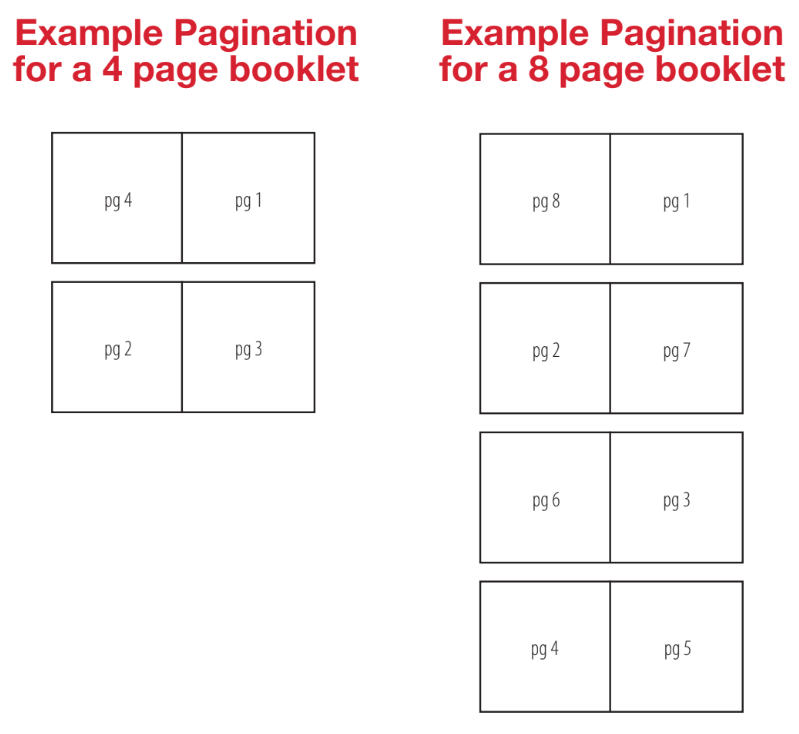
When designing folders or booklets, you need to lay them out using printer’s spreads. This means that we need your layout to be set up in the same manner that we will print and bind the job. For instance, a four-page booklet will have two printer spreads: the outside of the booklet having the cover (pg. 1) on the right and the back cover (pg. 4) on the left. The inside spread will contain pg. 2 on the left and pg. 3 on the right. The same is true for all other folders or booklets. Check out these images to see how Printer’s Spreads are laid out. Furnace can provide help in converting your design from Reader Spreads to Printer Spreads. Get in touch so we can learn more about your project.
Yes. It is highly recommended that you only view your digital PDF proofs using Adobe Acrobat. Furnace Record Pressing is not responsible for errors that are caused by using a different viewer. Acrobat is the only program that can accurately display all of the elements of a digital proof properly. Don’t use Apple’s Preview app or any other rag tag PDF viewers. Trust us.
Acrobat Reader is a free application from Adobe and can be downloaded here.
NOTE: It’s required to set “Use Overprint Preview” preference to “Always” in Preferences > General > Page Display.
Frequently Asked Questions
PROUD MEMBERS OF


©2026 Furnace Record Pressing. All rights reserved. | Privacy Policy